
Great September|Web Designer|2022
A festival lineup changes every year. The site shouldn’t have to.
Great September is Łódź’s annual music-industry festival — different lineup, different venues, same underlying structure. Designed as a system, not a page.
01 — Overview
Three days. A dozen venues. One question that can’t wait.
Great September launched in 2022 — Artur Rojek’s OFF Festival, Łukasz Minta’s Spring Break, and the city of Łódź, combined into one annual showcase event. The festival runs across a dozen locations at once. The site had to answer one question faster than anything else: what, where, when.
* On authorship
The gradient and visual identity were supplied by the agency’s brand team, not designed by me — my scope was the page architecture, the grid, and the component system built on top of it. No production analytics exist outside of Behance view counts, so no traffic or adoption numbers are claimed here.
02 — The Challenge
A dozen stages, all playing at once. Miss one and it’s gone.
A showcase festival is the densest event format there is — no single main stage, just a dozen venues running in parallel, minutes apart. Every visitor is choosing in real time. The site’s job wasn’t to list the festival — it was to make simultaneity feel navigable.
Alfah Femmes
EC1 · 19:00
Aljas
DOM · 19:00
Ania Leon
Las Palmas · 19:00
Anieli
Łódź Kaliska · 19:00
Asthma
6th District · 19:00
Bambi
P29 · 19:00
Bartek Deryło
Niebostan · 19:00
Barto Katt
Scenografia · 19:00
Bobkovski
Wooltura · 19:00
All nine fire in the same fifteen minutes. This is the problem the interface has to absorb.
03 — Approach
One system, so a dozen stages read like one.
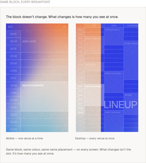
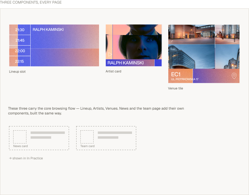
A shared grid and three repeating components — the lineup slot, the artist card, the venue tile — so a visitor learns to read the site once, then reads all of it. Consistency as a way to cut the noise, not just to save build time.
04 — Structure
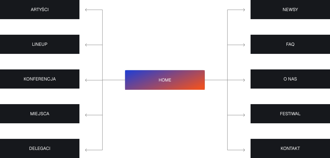
Ten destinations, one home.
Every page hangs off a single root — deep enough to hold a festival, shallow enough that nothing gets lost.
05 — Lineup
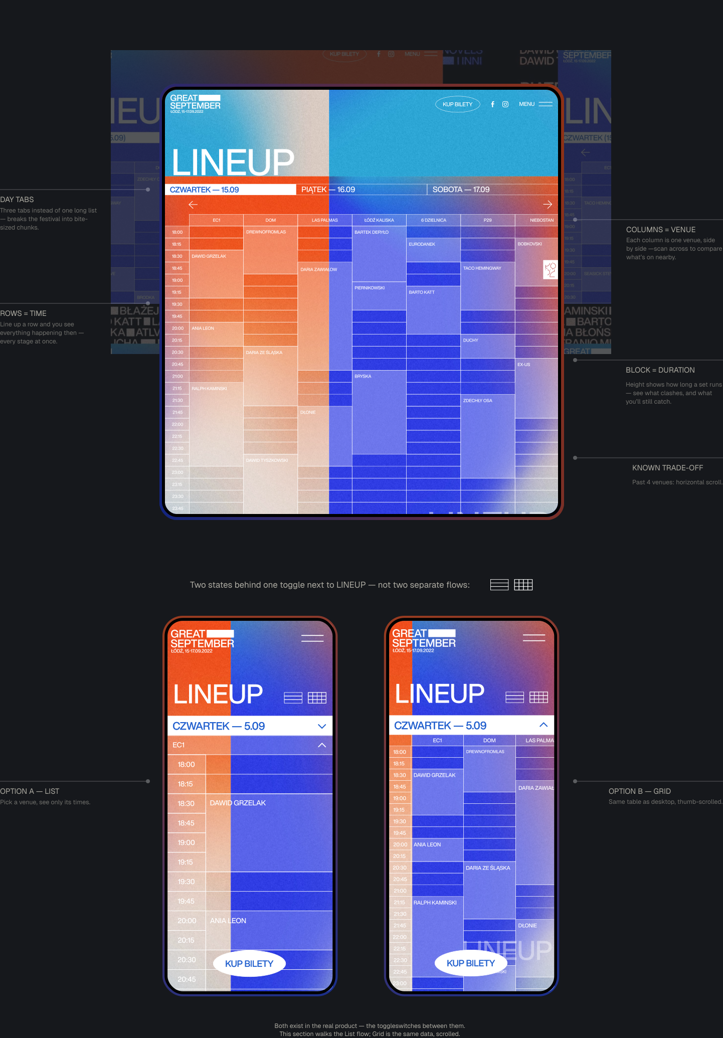
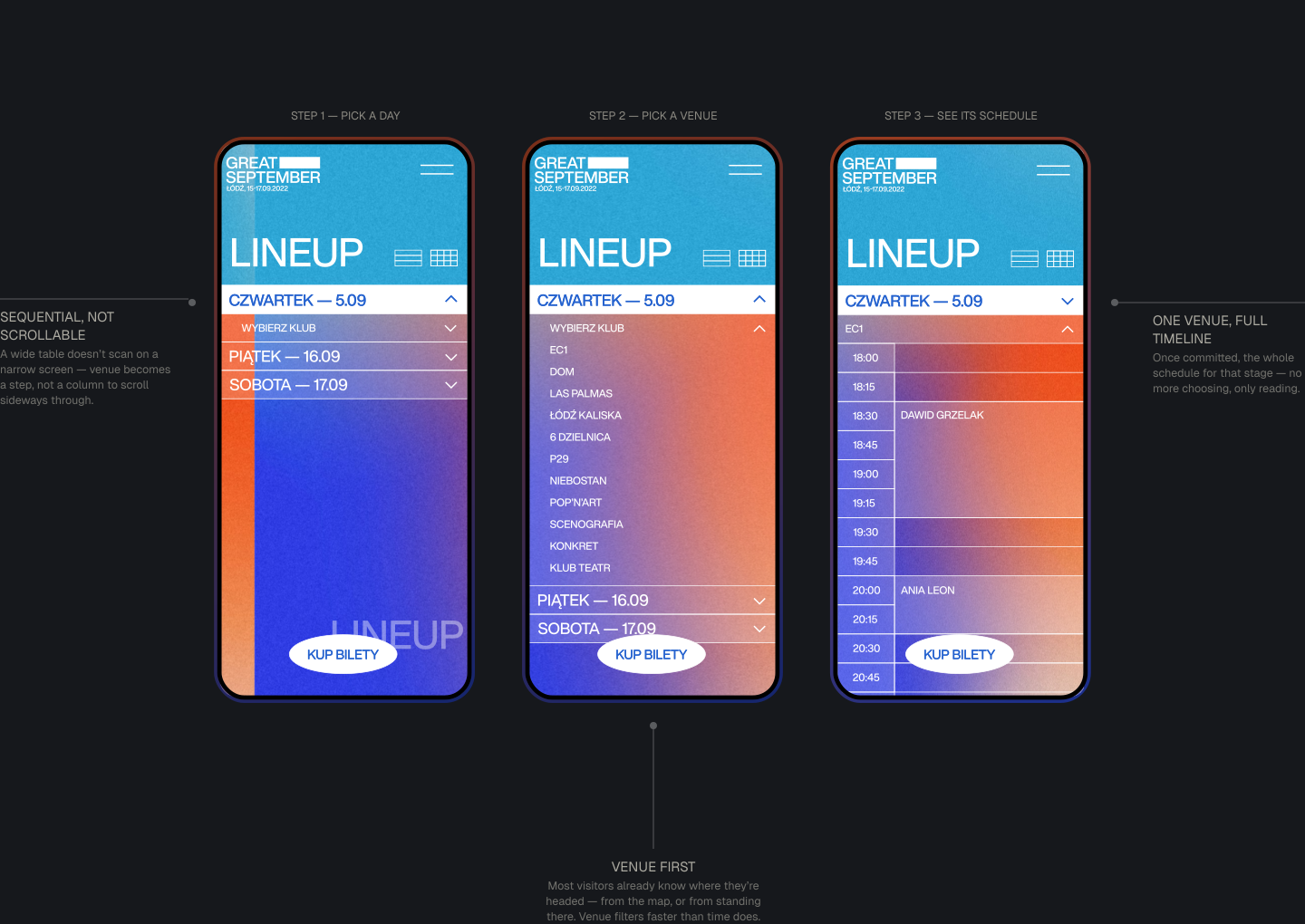
Scan by time. Scan by venue. Never lose either.
A festival lineup is three-dimensional data — day, venue, time. Most sites flatten it into one long list; this reads as a grid instead.
06 — Artists
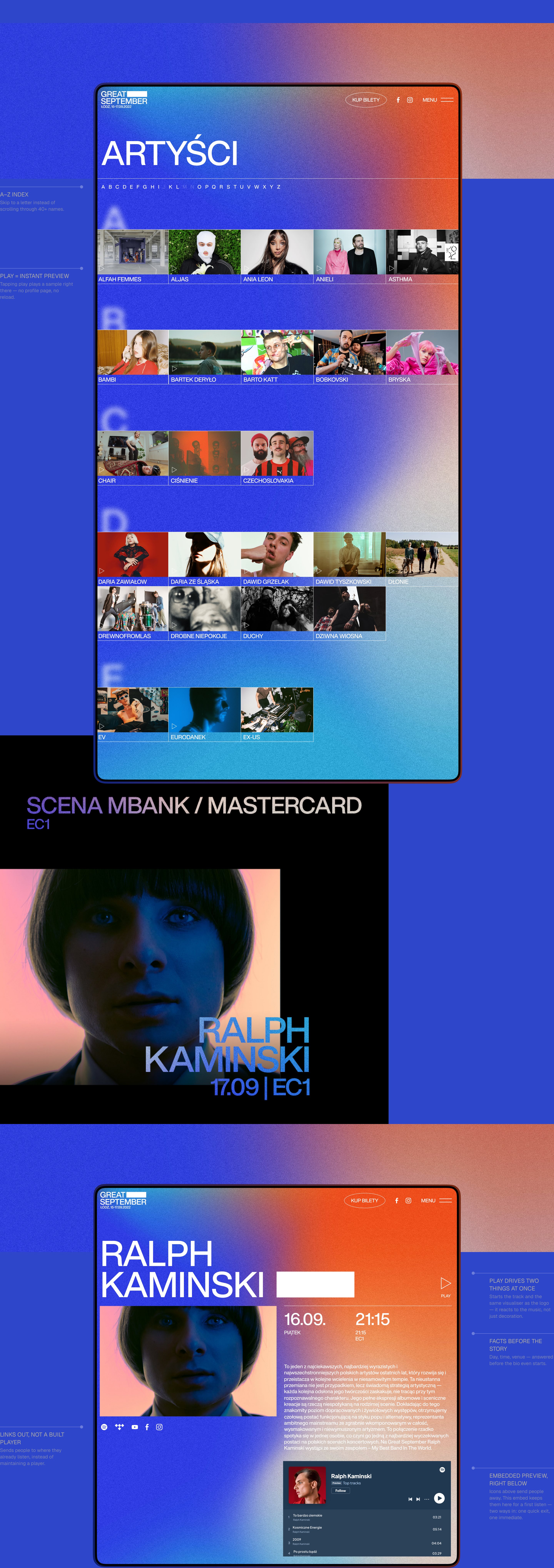
Forty acts. One index. Zero endless scrolling.
An A–Z jump index turns a wall of names into something you can navigate in one glance.
07 — Venues
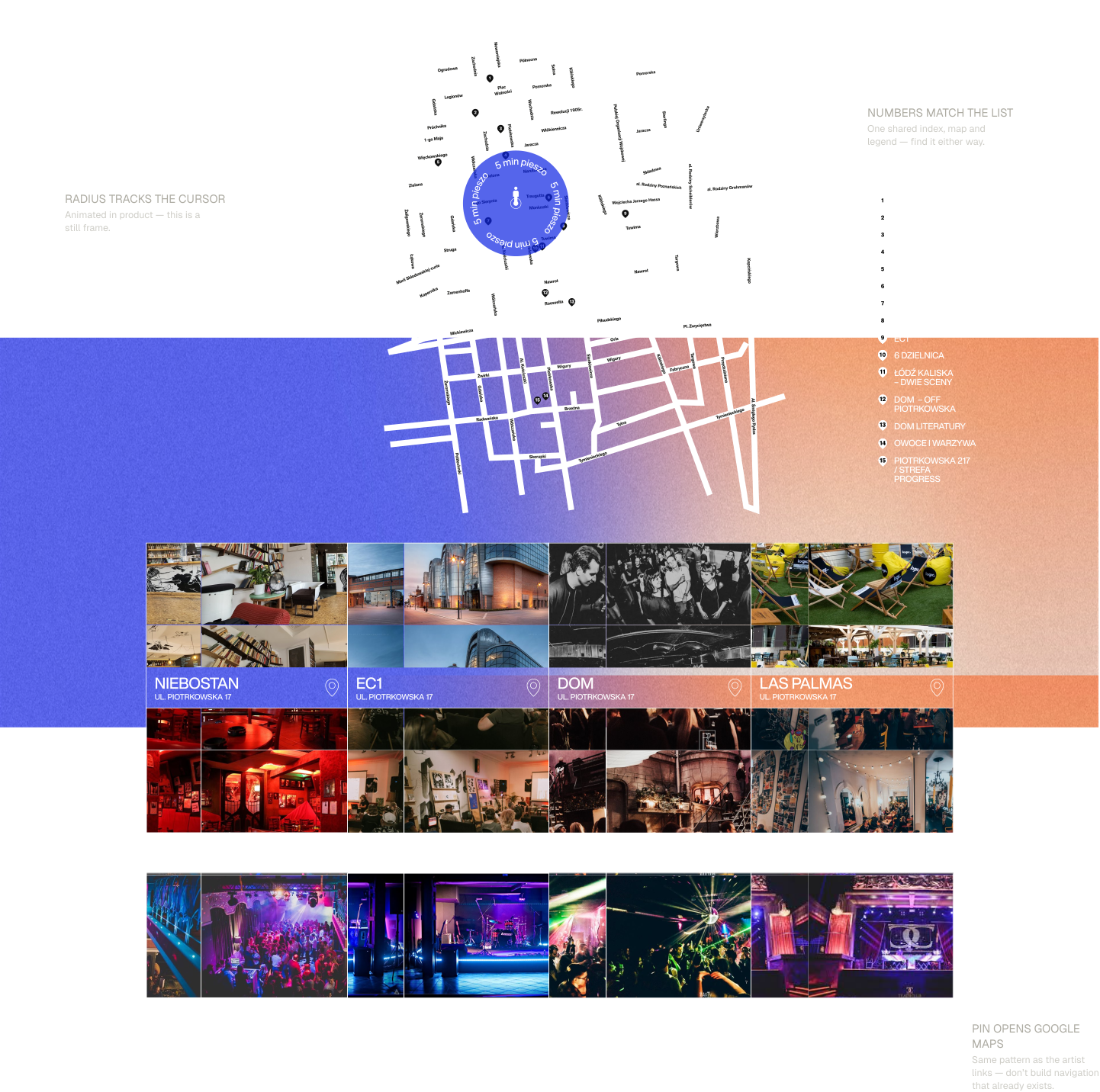
Fifteen stages, five minutes on foot.
The festival runs through real clubs and courtyards across Łódź. A walk-time map removes the mental math before the user even has to ask.
08 — In Practice
The same skeleton, different content.
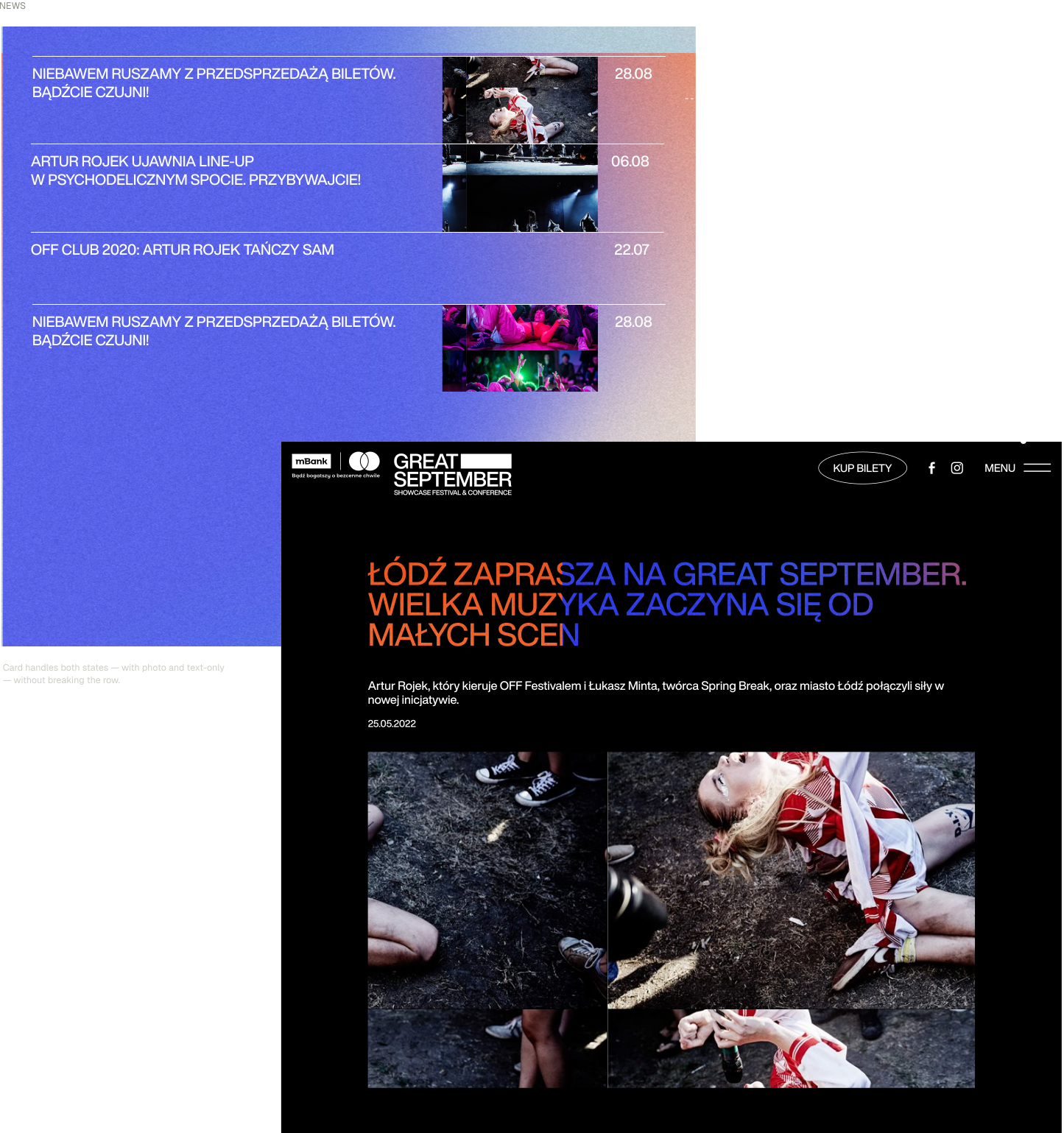
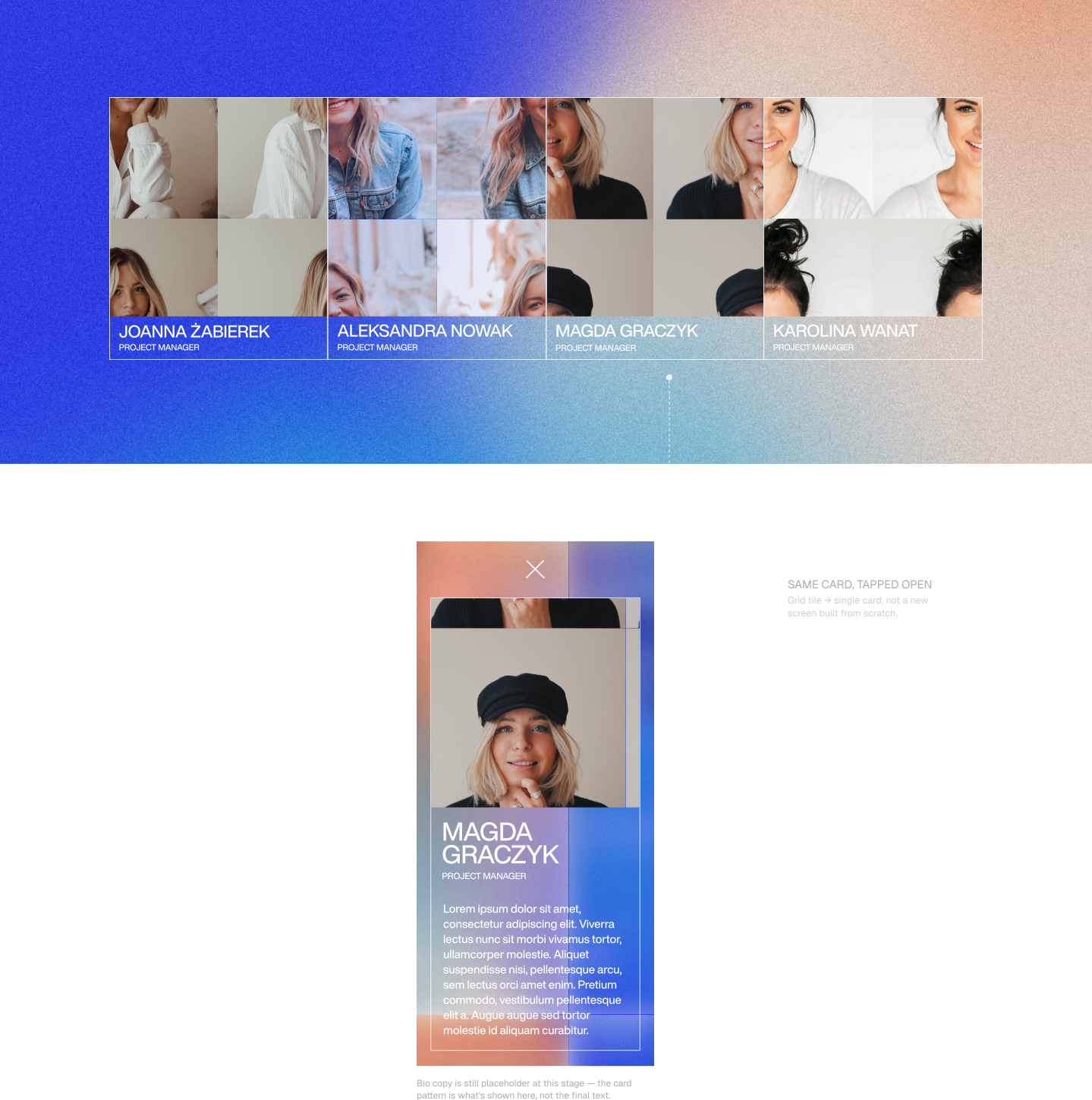
News and team pages borrow the same blocks as everything else — proof the system holds beyond the hero screens.