01 — Split 50/50 — product
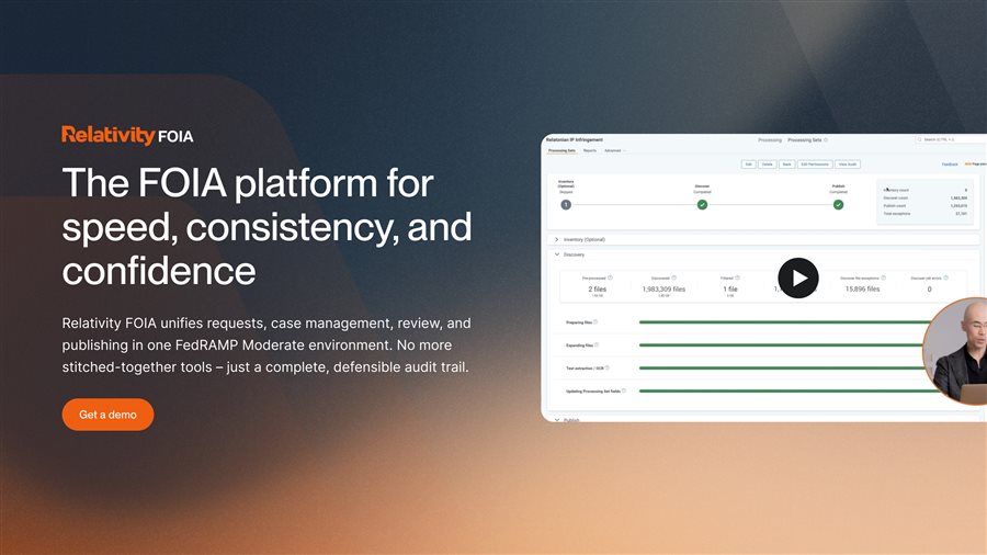
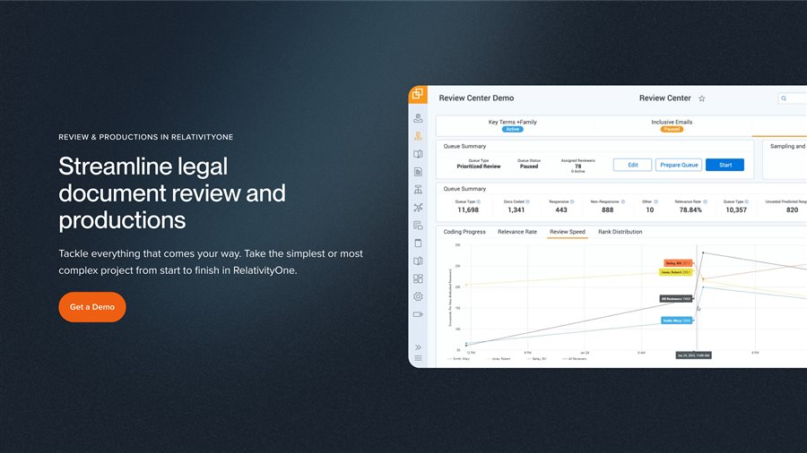
When the page has a specific interface to show off. Left column holds copy and CTA, right column shows the actual product UI.
Also Contracts · Investigations · Second requests · Legal Hold


Relativity | Senior Web Designer | 2023–2026
Responsible for evolving and maintaining the digital experience across Relativity’s global web ecosystem, supporting marketing, product marketing, events, thought leadership and brand initiatives.
01 — Overview
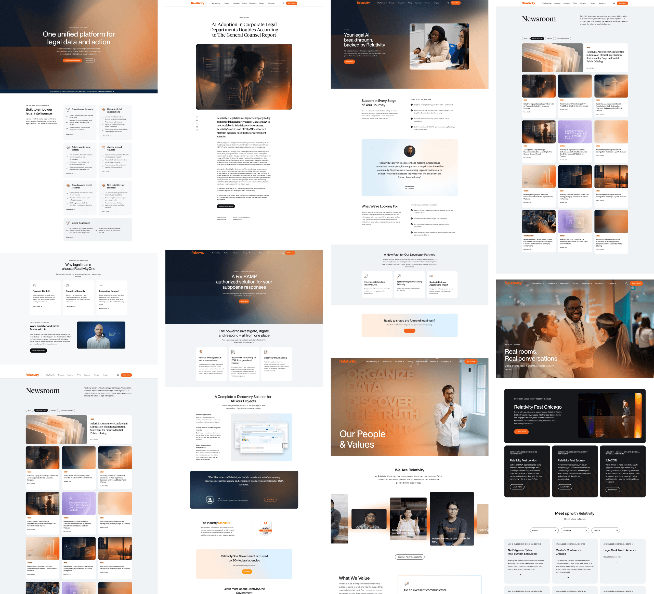
Three years shaping Relativity’s marketing web through a full rebrand — from the old visual language into the new one, mid-flight, without pausing releases. Across product marketing, events, thought leadership, and brand launches. My focus: turning a fragmented site into a scalable system that could carry the new visual language across 200+ pages.
02 — Information Architecture
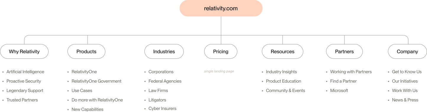
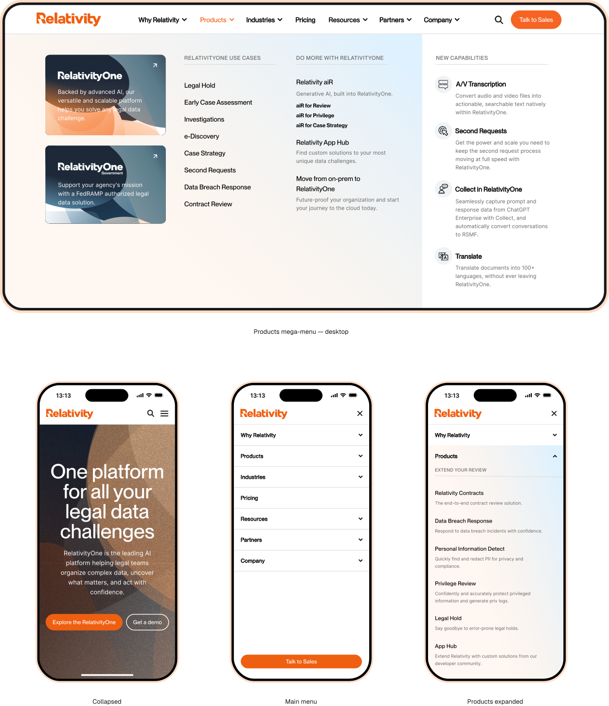
Products, industries, use cases, resources — plus a corporate hub for people, culture, and careers. Five entry points feeding 200+ pages. I helped shape the information architecture around content types and user intent, so navigation could hold the current portfolio and absorb whatever launches next.
Edge case
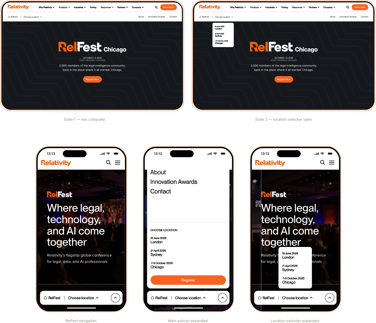
RelFest is a sub-brand living inside Relativity — it inherits the global nav, then adds its own location switcher across three cities, plus a dedicated subnav at the event level. A stress test for the navigation system: proof the structure holds under an extra layer of nesting without breaking down. Visual direction belonged to the brand team — my role was the interaction logic and information hierarchy.
03 — The Challenge
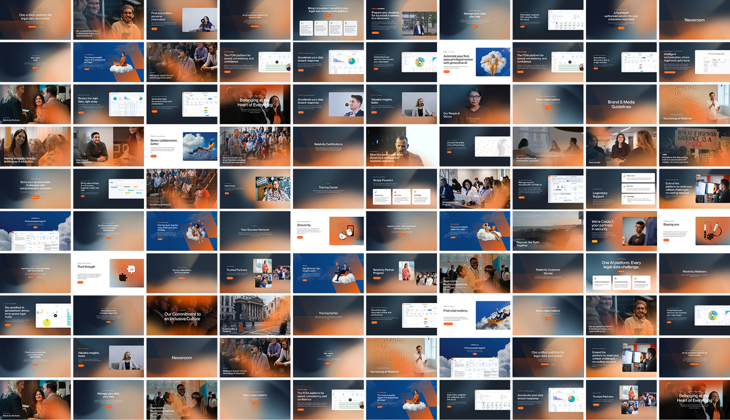
Designing one page was never the hard part. The challenge was one scalable visual system holding dozens of products, industries, and campaigns together — without breaking consistency.
04 — Hero System
Hero variants aren’t organized by site section — they follow content type. Same background system, six layout patterns, with a warm-to-cool tone modifier signalling page hierarchy.
When the page has a specific interface to show off. Left column holds copy and CTA, right column shows the actual product UI.
Also Contracts · Investigations · Second requests · Legal Hold
When it’s a hub, category, or editorial moment — no single UI to anchor on. Full-bleed gradient with typography centered.
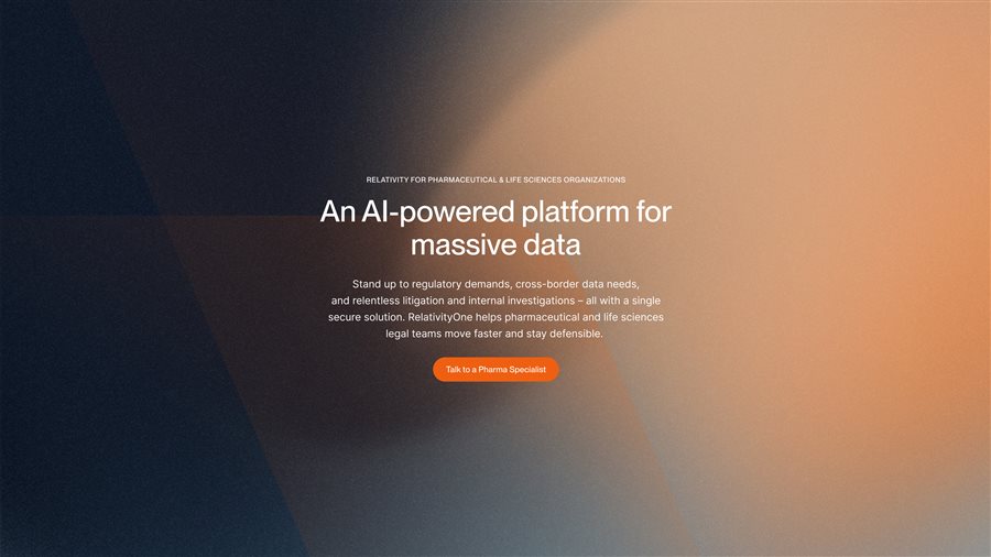

Also Industries (Litigators, Government) · Webinars · Early case assessment · AI overview
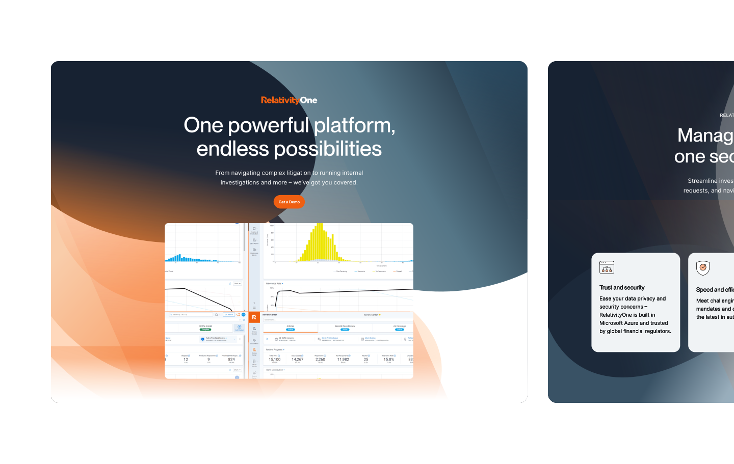
For flagship products. Centered typography sits above the fold, then the product screen breaks out below — the hero extends past a single viewport.
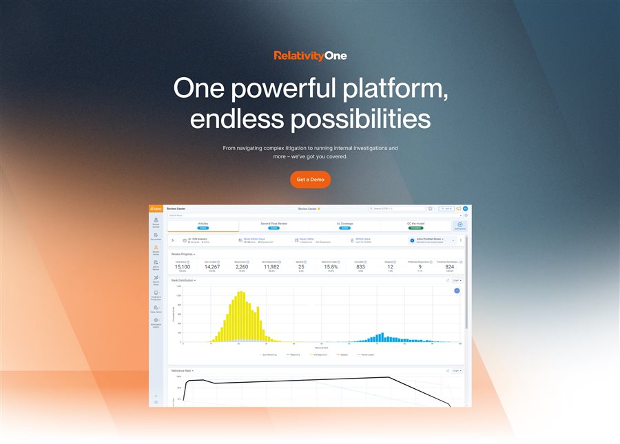
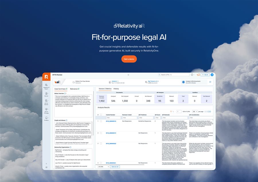
Also RelativityOne Government, RelativityOne Cloud
When the story leans on people and proof. Left column holds copy and CTA, the right stacks a photo collage sized by story weight.
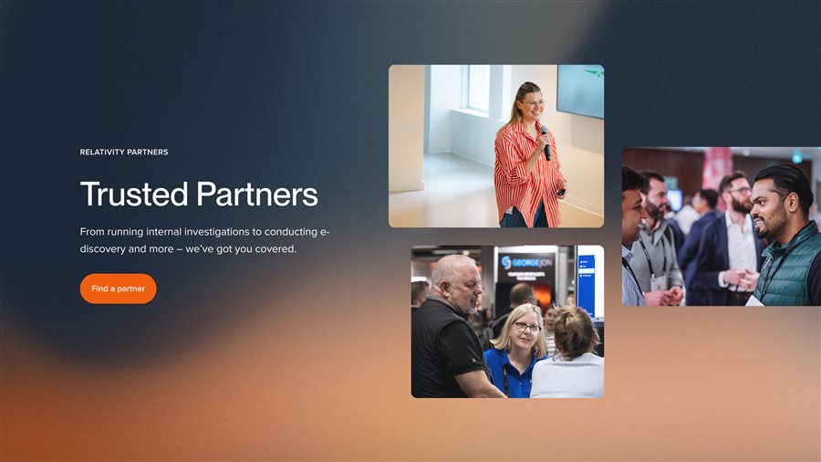
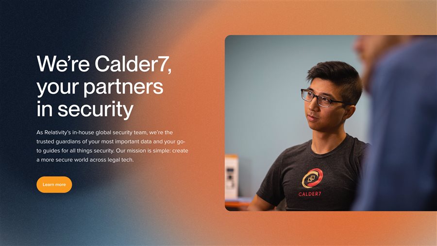
Also Security · Partner Programs · Community pages (photo count as story-weight modifier)
Hub pages introducing several value points. Right column stacks feature cards — orientation flips (vertical or horizontal) based on card count and copy density.
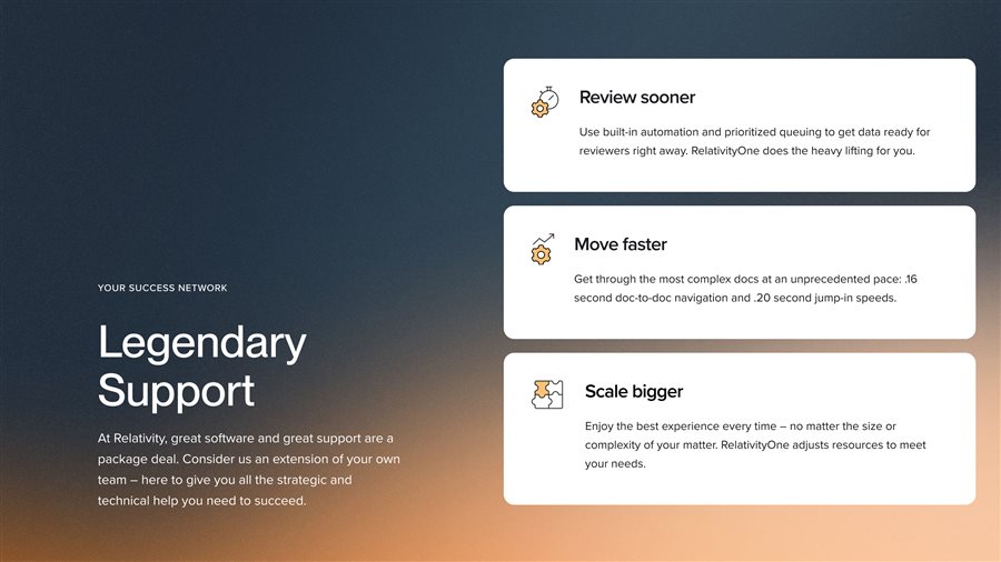
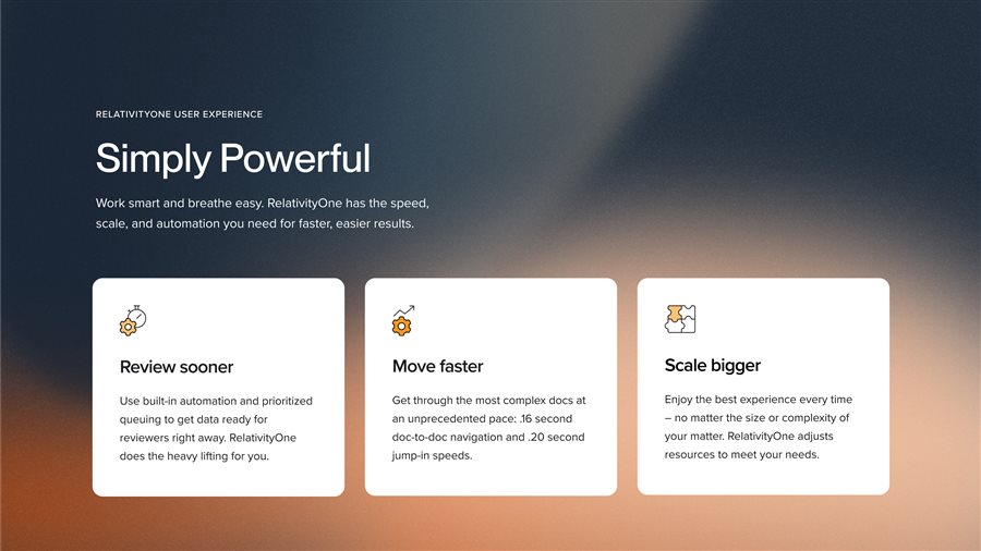
Also Why Relativity · Value propositions · Product overviews (orientation as content-density modifier)
When the story is culture, values, or human impact. Portrait imagery carries the emotion, typography sits low and quiet.
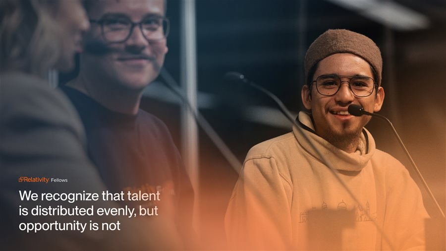
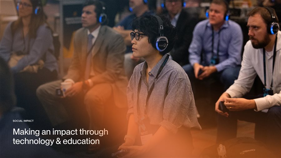
Also About · Careers · ESG landing pages
Background is a single system, not six. The navy-to-orange gradient is universal. What shifts is warmth (warm for conversion pages, cool for editorial hubs) and direction (top-left origin for splits, top-center for immersive). The aiR sky exception is deliberate — a sub-brand identity, not a break in the system.
05 — Design System & Brand
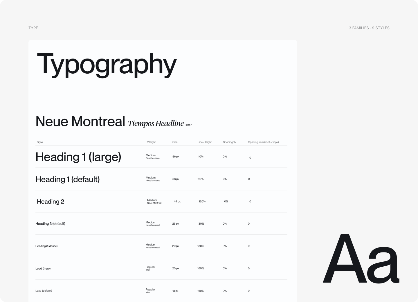
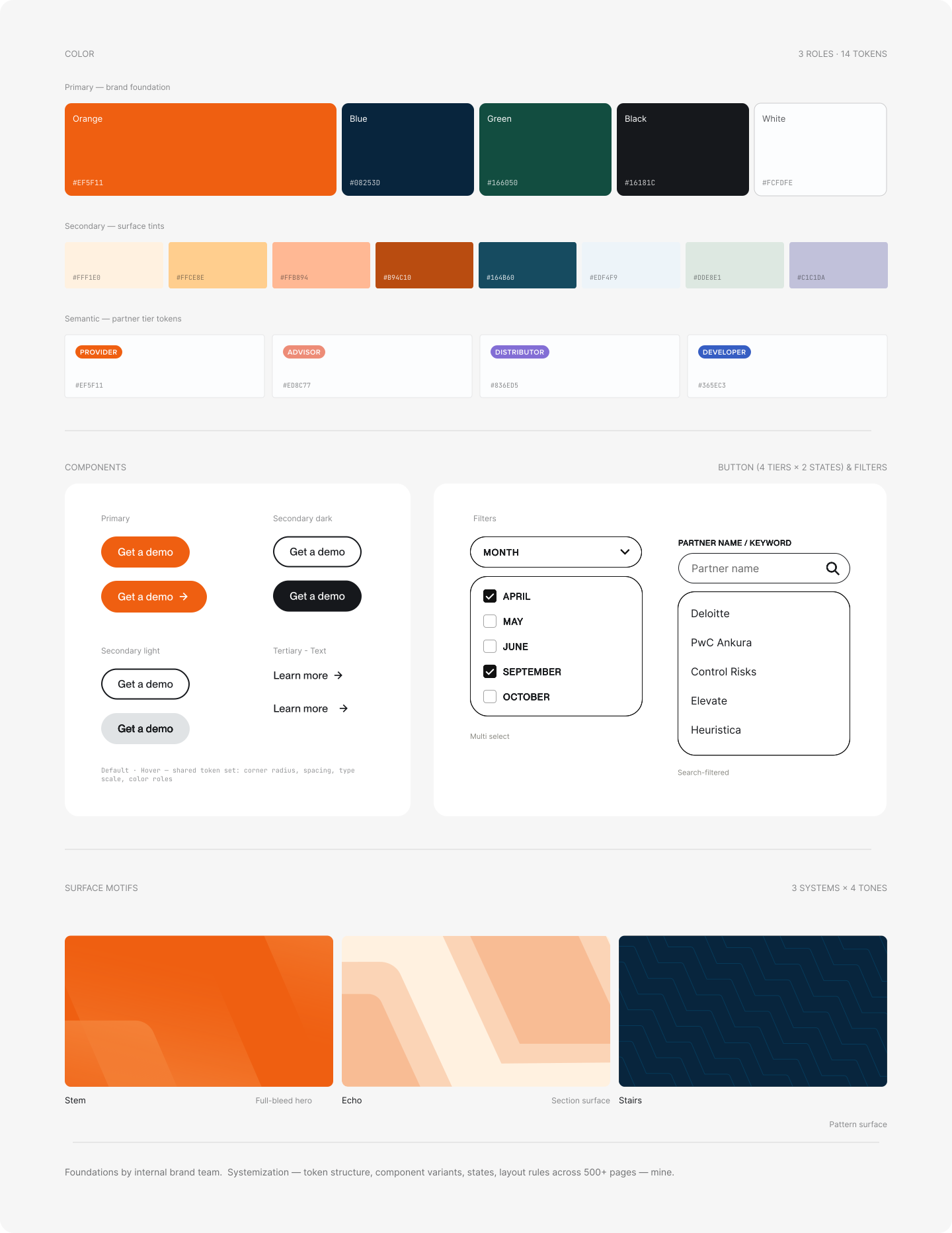
Tokens, components, and layout rules holding across 200+ marketing pages — built on foundations from the internal brand team.
Trade-offs I navigated
Where the system met reality — and what I chose to hold, bend, or teach.

Brand direction pushed for full-bleed where I’d have used a 50/50 split for legibility. I built both into the archetype set so campaigns could pick intentionally, not by default.

Six teams meant six rhythms. I kept the archetype set tight — six hero patterns, not sixteen — so anyone could pick without a designer in the room, with explicit escape hatches for RelFest and one-off launches.

The internal team reached for shortcuts that broke composition and hierarchy. Instead of patching pages after the fact, I ran recurring layout audits and paired reviews on the basics — grid, contrast, weight, spacing. Slower in month one; audits tapered off by month four.
06 — The system, applied
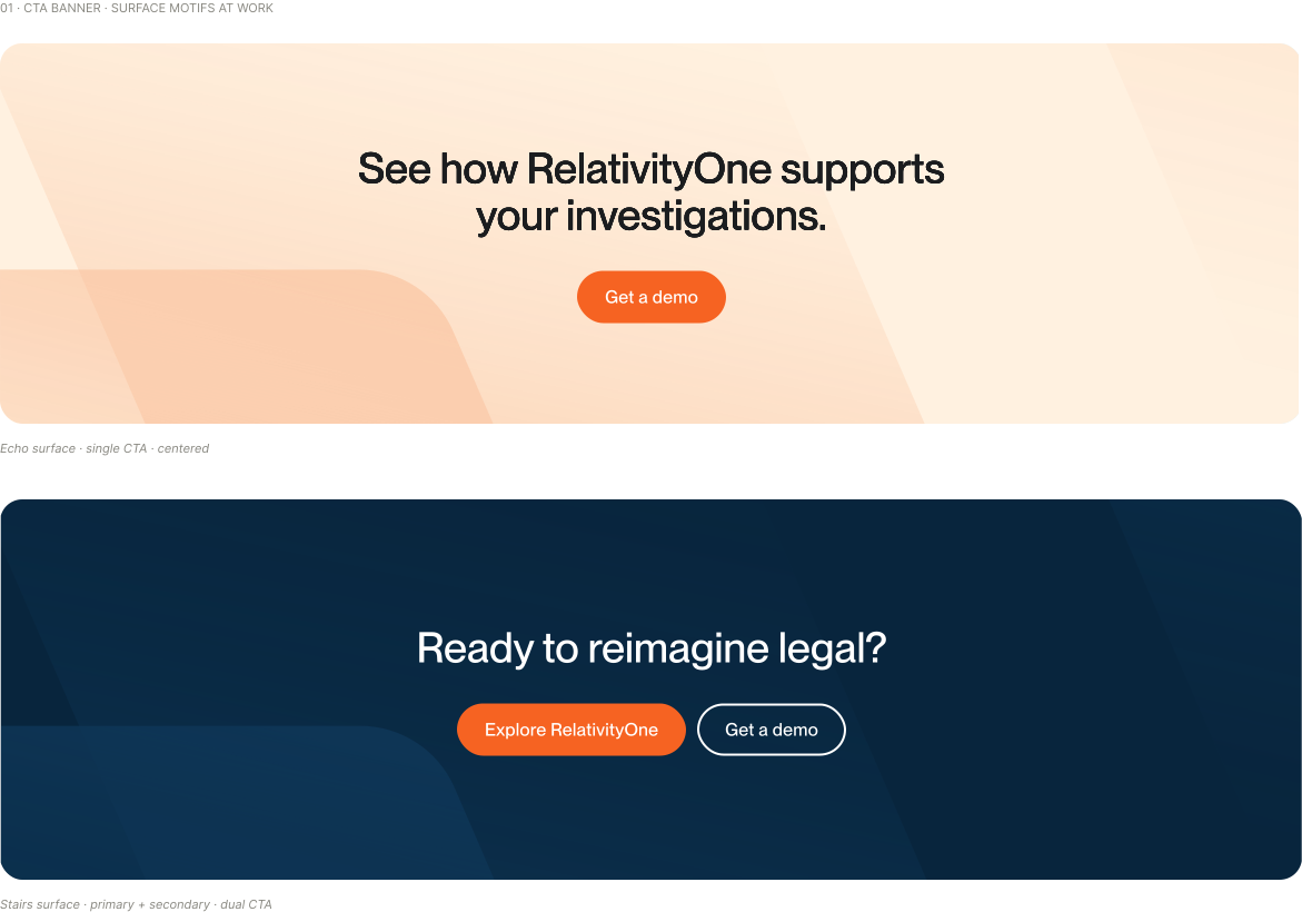
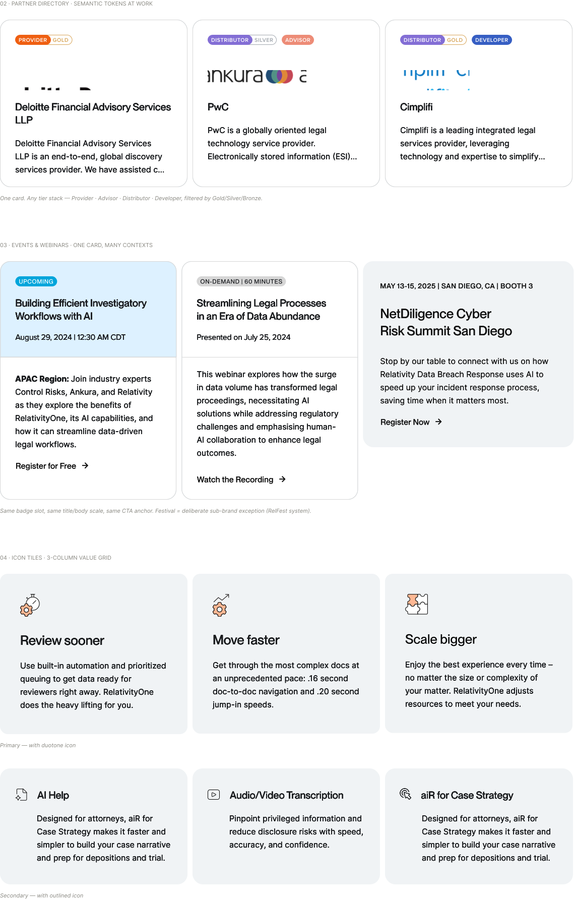
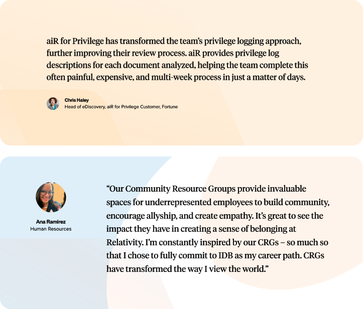
Same tokens, same rules — deployed across six recurring component families: CTA banners, partner and event cards, icon tiles, editorial, and content lists.

07 — Outcomes
Thirty-six months in, the system does the work. Faster launches, cleaner handoffs, and pages that convert because they’re built on patterns — not opinions.
“The design system that Kasia built cut our launch time in half — she gave every team a clear language to work in.”
Templated heroes and modular sections replaced from-scratch builds. Estimated based on delivery timelines pre- and post-system.
New IA and hero system, measured against a pre-rebrand baseline. Attribution: marketing analytics team, GA4 quarterly reports.
Six teams — brand, marketing, design, content, events, and development — shipped from one archetype set.
08 — The Seam
I led web design and system work across the rebrand — happening in parallel to launches, so the site had to hold two visual languages until the transition finished. Where the site plugged into brand, marketing, and dev, it started shaping the rebrand back.
What I owned
Grid, type scale, spacing, and hero archetypes. Built in Figma, mirrored in Webflow, adopted across six teams.
500+ pages across products, industries, events, AI, campaigns, and newsroom. Every page traceable to a pattern in the system.
Mentored the internal team on composition, hierarchy, and typographic rhythm. Ran layout audits, translated brand direction into web-native patterns, and contributed to the key visual and pattern library alongside the brand team.
Where web led brand
Brand direction came from the internal team. Some of the visual language emerged the other way — from web patterns that the brand team then carried into other channels.

Designed the gradient system for hero images. The brand team adopted it across social, campaigns, and print collateral.

Built the hero visual system from the ground up. Same patterns now anchor social posts, event graphics, and campaign hubs.

Set color decisions for WCAG compliance. Some palette choices didn’t clear the bar for web — those got adjusted at the source, not patched at the page.
The rebrand carried both hands — one from brand, one from web.